Readers begged, "Save the hole!"

A Company's Unusual Competitive Advantage

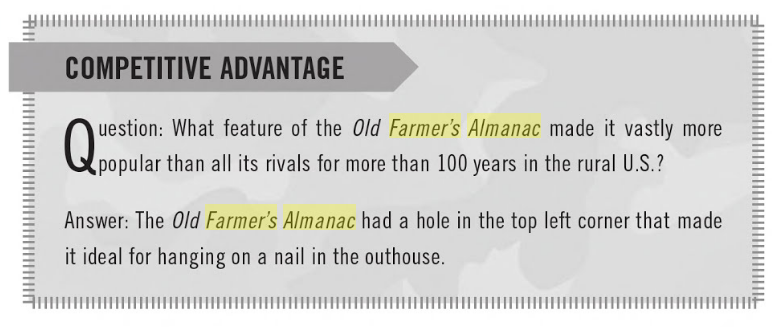
Most of us are familiar with the Old Farmer's Almanac. That little book that predicted the weather almost 2 years before it happened, contained articles on everyday topics like gardening and cooking, short stories and a separate section that focused on upcoming lifestyle trends. Most of us also remember the hole it had in the upper left-hand corner of the book. But do you know why it's there? And if you do, why is it still there today?

So there you have it!  That hole had a practical purpose in the lives of those it guided and the publishers understood that. Years later, that pre-drilled hole is one of the main reasons it outlasted all other versions of the Farmer's Almanac.

Judging by the reader comments found on the company website, it's obvious that they still love this little book.


"I LOVE 'The Old Farmer's Almanac'...I keep my copy,,in ,, you guessed it, the bathroom...shhh, don't tell everyone!!
Anyway...we all love it here in our house..it make good reading, in , well all places..:)
I also use MY copy in the kitchen. I love all of the recipes..from 'days gone by' a lot of the time...thank you 'old farmer's Almanac'."

"I am 74 years old and have bought a copy of the Old Farmer's Almanac since, I think, 1949. Haven't missed a copy yet."


By the 1990s, the use of outhouses wasn't common and the company thought that the hole no longer served a purpose, so it stopped drilling it and saved $40,000 per year on drilling costs.  Subscribers reacted and became very protective: "It was an overwhelming response. 'Save the hole.' 'Leave that hole alone.' That's what readers were telling us," says Ginger Vaughan, a spokesperson for the company.

This "hole" is still something readers want, even today. For them, it represents authenticity and has become part of the brand. You can purchase your copy from their website... choose from several options, one of which comes with a free hole! Adorable.

Branding doesn't have to be complicated. It can be practical and simple.

This year, The Old Farmer's Almanac celebrates its 225th year with a special anniversary edition of the book, also available in digital format and it comes with (you guessed it) a "digital hole".

Morty Silber, CEO

Mad Strategies Inc.
a Wizard of Ads Partner

Morty SilberComment
Colour Blocking

How to stand out on the retail shelf!

The use of colour blocking started in the world of fashion. It was, and still is, being used to make clothes, handbags and shoes pop!, combining solid blocks of color together to make a bold statement. Although the trend has been around for a long time, it has only recently made its appearance as a tool in design.

The fashion world combined high contrasting colours to create a stunning visual effect but today color blocking is used to create a bright, simplified and pleasing visual effect in logos, website design, and marketing materials including product packaging. The emphasis being only a few solid colours with an ultra simplistic way.

The one aspect of colour blocking is its use in making a product stand out from all others on the store shelf, thus ensuring its survivability.

When designing a product's packaging, consider where the product will "live". What competing products will it be next to? Get a sense for the landscape by walking through the areas where it will likely be sold. Take note of the other products, colours, style of labels and graphics used and what your product will be up against. Make choices that will contrast with your competitors and what you have seen.

Second, keep your packaging ultra-simple. The cluttered retail landscape has rendered many products invisible. A solid block of color is a clean and elegant way of standing out from your competitor, and it's easy on the eyes. 

Here are a couple examples of products that used color blocking to their advantage.

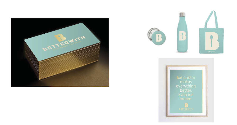
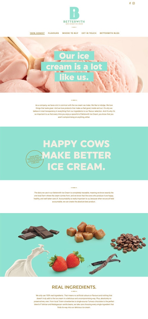
Betterwith Ice Cream wanted to have a presence among the ice cream brands. When conceptualizing their brand, they used a "Tiffany blue", which we associate with quality and isn't readily used in the ice cream industry. They also carried their color blocking into their website and marketing materials.

Notice the incredible simple logo design in plain white and the unique use of a spoon for the inside of the "B". The tagline is also  simple yet makes you want to know more about what it means.

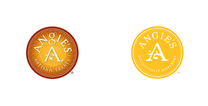
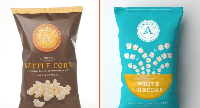
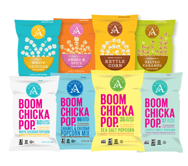
Angie's (Kettle corn & BOOM CHICKA POP popcorn) revamped their brand presence with a new logo and fresh packaging in an effort to give their product a "visual" leg up. They use a different colour block for each flavour allowing them to really stand and basically take over the crowded retail space. The assortment of colours became part of the draw and the "Angie's" experience.

Before rebrand (left) & After rebrand (right)

Colour blocking can be a very effective way of demanding attention from passers by not just in the food industry but in any industry where your product sits next to other products on a crowded shelf. 

Does your product stand out on the retail shelf? Would it benefit from a colour block revamp?

Morty Silber, CEO

Mad Strategies Inc.
a Wizard of Ads Partner

Morty SilberComment
Start With The Truth - Then Bond Over It

My partner, Jeff Sexton, wrote such a great blog post this week. I felt the need to share it with you. Enjoy!
___________


It’s one of the best ad campaigns from the last two decades.

To the point where it’s become a massive internet meme you’ll recognize as soon as you read the phrase: “I don’t always X, but when I do, I Y

From a “going viral and impacting the culture” standpoint, that’s a huge victory for Dos Equis’ “The Most Interesting Man In the World” campaign.

But did you know the campaign also sold an equally epic amount of beer?

Or that it consistently created increased sales every year of its 10-year run, from 2006 until 2016?  When the whole of North America was opting for craft and micro brews over imports, Dos Equis was up 34% by the end of the campaign.

So what’s the secret behind this phenomenally successful campaign? It started with some basic truths that connected:

  1. The target market, and
  2. The product itself

The Essential Truths About The Target Market

As for the target market, here’s a quote from Ken Kuenz, the then-CMO of Heineken (yes, Heineken — ownership of breweries and distribution rights is complicated, OK?

“We had a consumer segmentation study and the target segment was “monsters” — young guys who go out A LOT, and drink A LOT and don’t care what they drink. This was the insight that informed “I don’t always drink beer” line. The line was controversial internally, but it was rooted in consumer truth.

Casting an old guy was controversial. Originally Euro presented younger guys more in the target. But the concept wasn’t credible without the guy being more seasoned. The inspiration was the uncle who never got married and was always doing cool shit, Hemingway-esque…

…The original tagline was a lame translation of the strategy statement, something like “Dos Equis, the most interesting beer in the world.” Our challenge was always can’t we say it without saying it. And right before the work was going to be shown at the [distributors] convention, Kling called me up and said I think I’ve got it, would you consider changing the end line to “Stay thirsty, my friends.”

And here’s a quote from another insider from the campaign:

When we pitched the campaign, we imagined the MIM as an older man — the embodiment of a life well-lived… We wanted to address any concerns about casting a gray-haired man so we created additional comps for focus groups with a few younger men in them… Side note: The closer the MIM was to the age of our respondents, the less appealing he was. He became threatening and they disliked him. The MIM was meant to be aspirational and that only worked when he was significantly older than the target, since that gave the target a few decades to become just as interesting.

Do you get the important points, here?

It wouldn’t be credible for the Most Interesting Man to always, or even usually, drink beer. He’s cultured, and a man’s man. Think Hemingway-meets-James-Bond: a man who drinks martinis and scotch and well-aged rum. So the line, “I don’t always drink beer” nods to that truth about the character — which reflects an important truth about the audience as well.

This was more of a bonding campaign than a traditional branding campaign.

In some ways you could think of Dos Equis’ Most Interesting Man as The Marlboro Man rebooted for the 21st Century. And in turn, you could think of The Man Your Man Could Smell Like, as the MIM’s younger brother.

All three are campaigns focused on creating an emotional and aspirational bond with target audience with only a rather tenuously associative (but still important!) connection to the product itself.

Remember, explicitly saying that Dos Equis was the most interesting beer in the world was lame, while having the most interesting man in the world prefer Dos Equis (when he occasioned to drink beer) was gold.

Great writers don’t speak about character and action, they speak through character and action. That’s how you say it without saying it. And it’s what makes these kinds of bonding campaigns so powerful. People bond over the imagery and values of the character, rather than any kind of logical evaluation of the product.

All of which is why it was so important that the Most Interesting Man be older:

  • First, there’s the basic truth that any man needs time to accumulate life experiences and great stories — again start with (and stick to) the truth!
  • Second, as the second quote states, the target audience needs to feel that they can aspire to become the MIM, and thereby identify with him, rather than feeling outcompeted by him.

The Essential Truth About The Product

Before the campaign, Dos Equis was a niche import: a premium beer from Mexico.

And if you’re in charge of getting more people to buy more of that beer, you’re basically in charge of getting those beer drinkers to change their mind about the beer. Which means you can do one of two things

  1. Present them with new information with which to make a new decision, or
  2. Make them feel differently about what they already know

In this case, what those beer drinkers already “knew” about Dos Equis was that it was an unusual contrast: Expensive Mexican beer?

The way to get people to feel differently about that unusual contrast was to frame it as interesting and intriguing rather than odd or questionable.

Where the creative team tapped into genius was the Hemingway connection.

Because of Hemingway’s well known love of Cuba, most American’s had a built-in, Spanish-speaking, south-of-the-border association with the idea of an iconic manly-man-of-many-tales. So connecting the unusual Dos Equis with the inherently interesting Hemingway-esque character allowed people to bond with both the character and his preferred beer.

In other words, the team started with the essential truth about the product: it WAS interesting to have a premium beer from Mexico marketed in North America.

Think about it, would that campaign have worked for freaking Budweiser? Or Molson? Hell, no!

So if you’re going to copy something from this campaign, don’t blatantly rip off the “I don’t always” line. Copy the desire to start with the truth.

P.S. Of course, the writing talent for these commercials was off the charts brilliant for this campaign, as well. Would it surprise you to learn that the writers created their own style guide that said what could and could not be done by the Most Interesting Man?

Morty Silber, CEO

Mad Strategies Inc.
a Wizard of Ads Partner
Morty SilberComment