Colour Blocking
How to stand out on the retail shelf!
The use of colour blocking started in the world of fashion. It was, and still is, being used to make clothes, handbags and shoes pop!, combining solid blocks of color together to make a bold statement. Although the trend has been around for a long time, it has only recently made its appearance as a tool in design.
The fashion world combined high contrasting colours to create a stunning visual effect but today color blocking is used to create a bright, simplified and pleasing visual effect in logos, website design, and marketing materials including product packaging. The emphasis being only a few solid colours with an ultra simplistic way.
The one aspect of colour blocking is its use in making a product stand out from all others on the store shelf, thus ensuring its survivability.
When designing a product's packaging, consider where the product will "live". What competing products will it be next to? Get a sense for the landscape by walking through the areas where it will likely be sold. Take note of the other products, colours, style of labels and graphics used and what your product will be up against. Make choices that will contrast with your competitors and what you have seen.
Second, keep your packaging ultra-simple. The cluttered retail landscape has rendered many products invisible. A solid block of color is a clean and elegant way of standing out from your competitor, and it's easy on the eyes.
Here are a couple examples of products that used color blocking to their advantage.
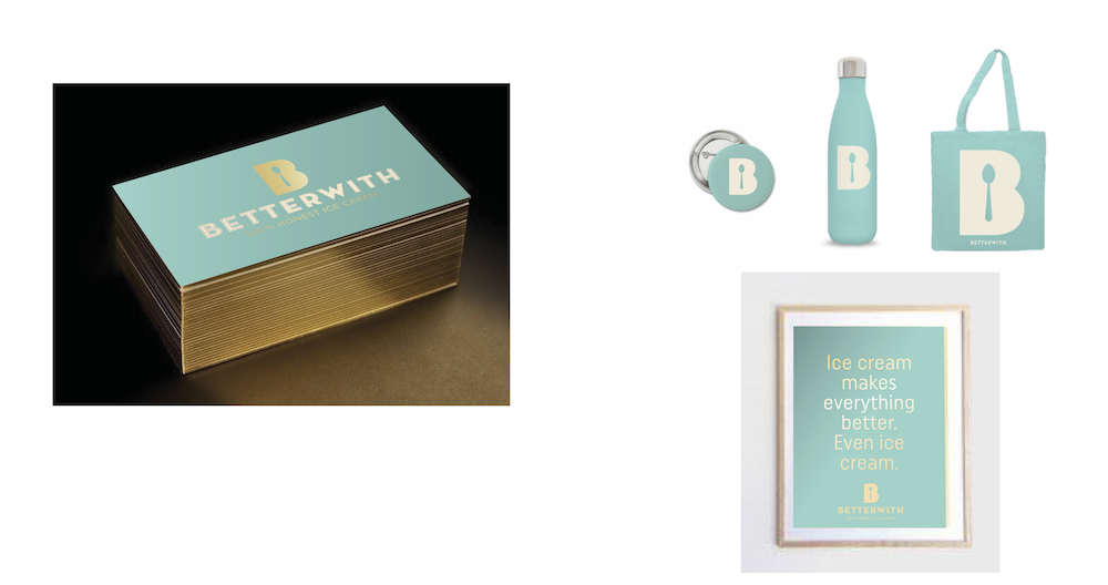
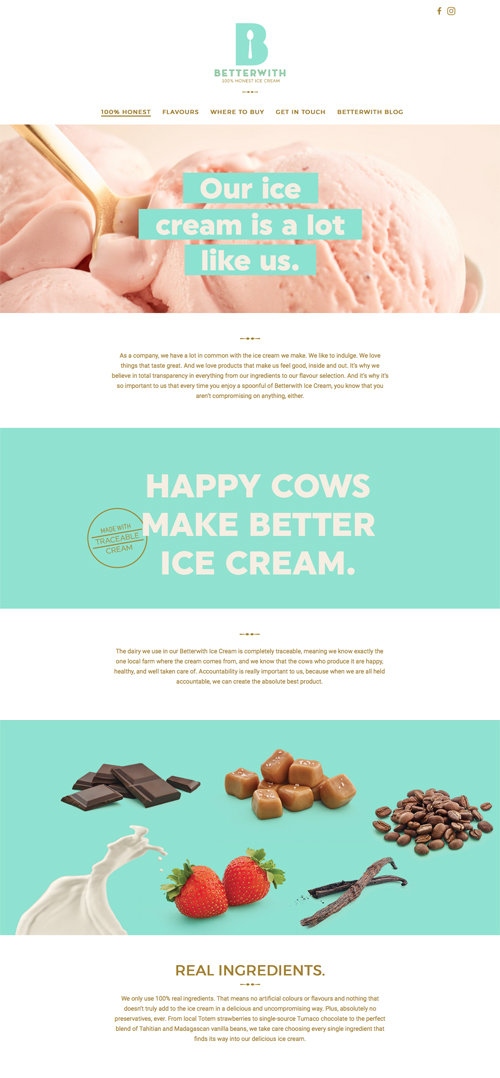
Betterwith Ice Cream wanted to have a presence among the ice cream brands. When conceptualizing their brand, they used a "Tiffany blue", which we associate with quality and isn't readily used in the ice cream industry. They also carried their color blocking into their website and marketing materials.
Notice the incredible simple logo design in plain white and the unique use of a spoon for the inside of the "B". The tagline is also simple yet makes you want to know more about what it means.
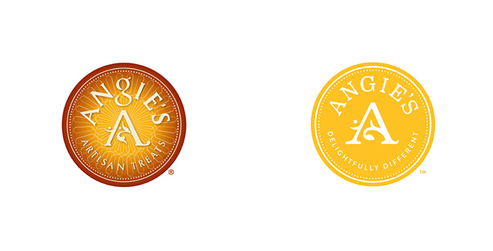
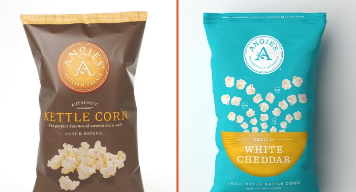
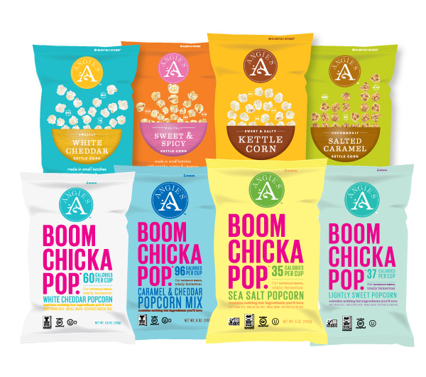
Angie's (Kettle corn & BOOM CHICKA POP popcorn) revamped their brand presence with a new logo and fresh packaging in an effort to give their product a "visual" leg up. They use a different colour block for each flavour allowing them to really stand and basically take over the crowded retail space. The assortment of colours became part of the draw and the "Angie's" experience.
Before rebrand (left) & After rebrand (right)
Colour blocking can be a very effective way of demanding attention from passers by not just in the food industry but in any industry where your product sits next to other products on a crowded shelf.
Does your product stand out on the retail shelf? Would it benefit from a colour block revamp?
Morty Silber, CEO
Mad Strategies Inc.
a Wizard of Ads Partner


